Comm Colo
Comm Colo
Comm Colo
Project
Comm Colo
Project
Comm Colo
Project
Comm Colo
Location
New York
Location
New York
Location
New York
Year
2024
Year
2024
Year
2024
Role
Direction + Execution
Role
Direction + Execution
Role
Direction + Execution
INFO
Commercial Colo unites over 600 employees in the commercial space, with a brand identity grounded in themes of growth, connectivity, engineering, and building. From a creative direction standpoint, the challenge was to design a visual system that captured these themes while maintaining adaptability and longevity.
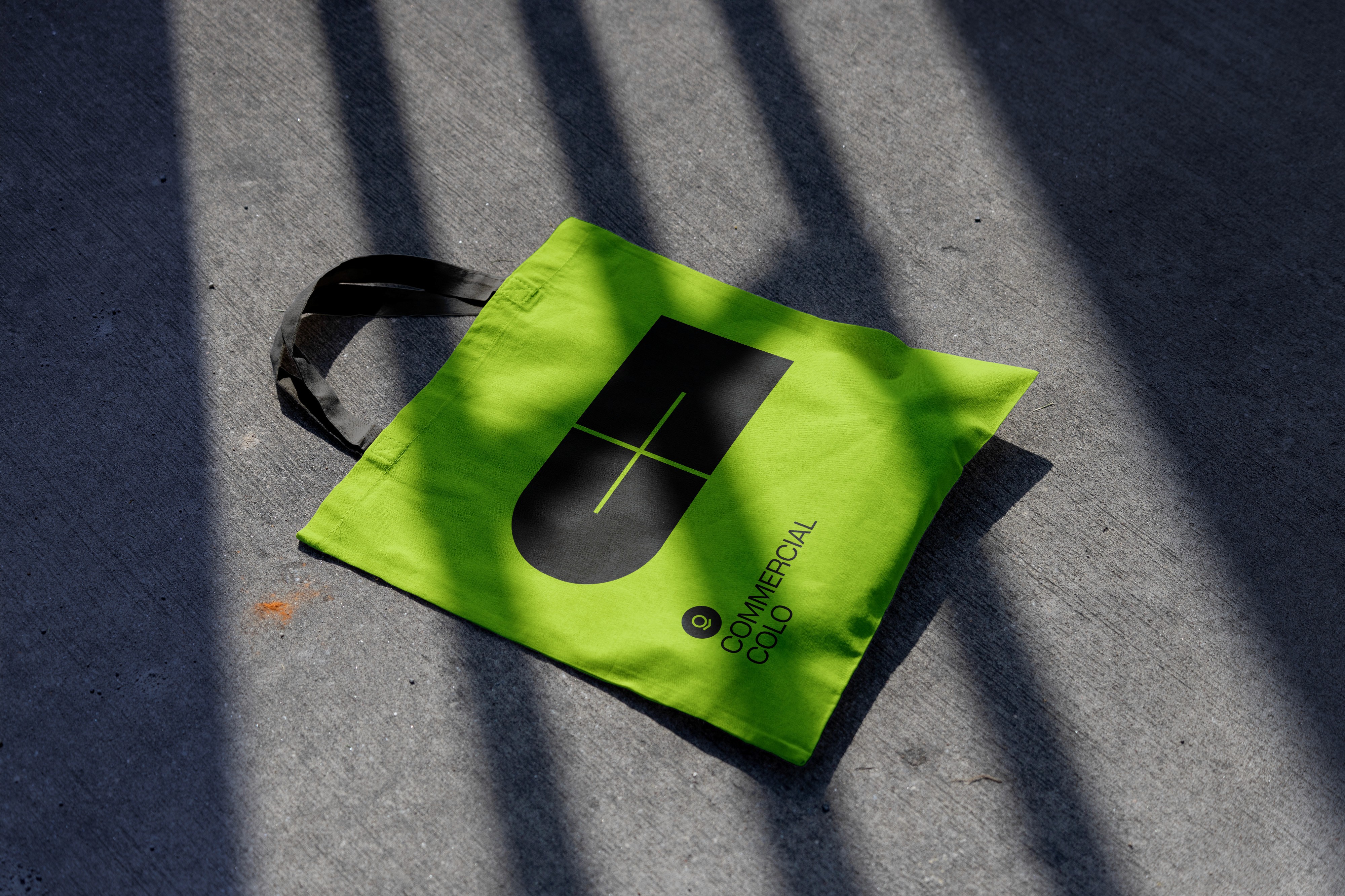
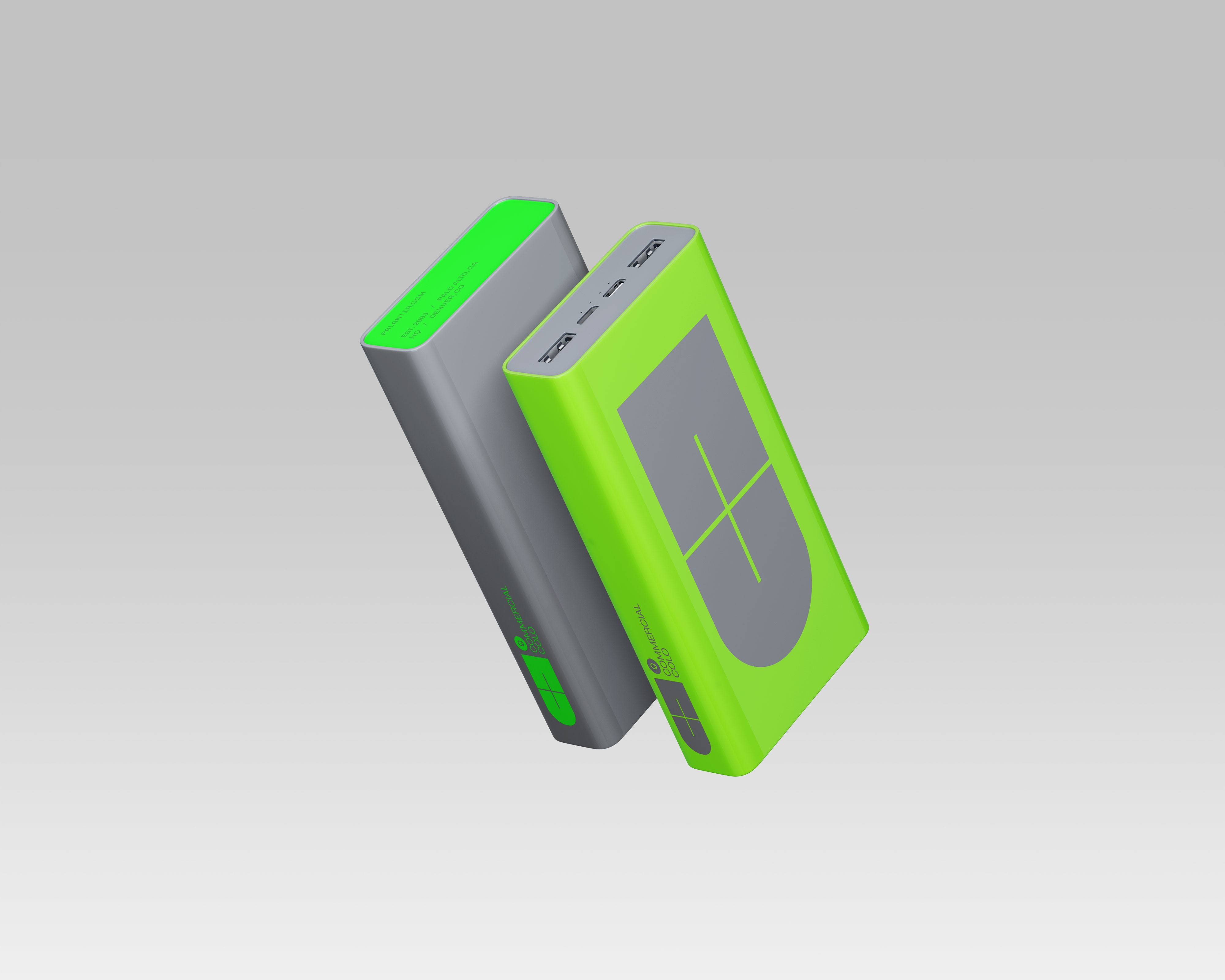
At the heart of the design is a simple square grid that forms two abstract ‘C’ shapes: one with a curved open counter and another with a square-shaped open counter. When the square-shaped ‘C’ is flipped, these shapes combine to create a ‘+’ in the negative space, complemented by a clean "Commercial Colo" logo lockup. This concept subtly draws inspiration from a magnet and a battery, symbolizing the event’s ability to attract, energize, and foster collaboration. The ‘+’ symbol emphasizes growth, innovation, and connectivity.
The minimalistic approach to the ‘C’ shape takes cues from the S-curve, symbolizing impactful growth and momentum. The square ‘C’ reinforces this by highlighting commercial strategy, with visual ties to engineering and building processes.
To ensure the system’s versatility, it incorporates space for the Palantir Chevron and a location indicator, allowing seamless updates for future iterations. This cohesive visual identity not only reflects the event's purpose but also underscores Palantir’s broader narrative of innovation, collaboration, and progress.
INFO
Commercial Colo unites over 600 employees in the commercial space, with a brand identity grounded in themes of growth, connectivity, engineering, and building. From a creative direction standpoint, the challenge was to design a visual system that captured these themes while maintaining adaptability and longevity.
At the heart of the design is a simple square grid that forms two abstract ‘C’ shapes: one with a curved open counter and another with a square-shaped open counter. When the square-shaped ‘C’ is flipped, these shapes combine to create a ‘+’ in the negative space, complemented by a clean "Commercial Colo" logo lockup. This concept subtly draws inspiration from a magnet and a battery, symbolizing the event’s ability to attract, energize, and foster collaboration. The ‘+’ symbol emphasizes growth, innovation, and connectivity.
The minimalistic approach to the ‘C’ shape takes cues from the S-curve, symbolizing impactful growth and momentum. The square ‘C’ reinforces this by highlighting commercial strategy, with visual ties to engineering and building processes.
To ensure the system’s versatility, it incorporates space for the Palantir Chevron and a location indicator, allowing seamless updates for future iterations. This cohesive visual identity not only reflects the event's purpose but also underscores Palantir’s broader narrative of innovation, collaboration, and progress.